A website brings in no enquiries when visitors can’t immediately see what you solve, for whom, and what they should do next. That is rarely a design problem. Usually what’s missing is the clarity that should have been created before the design. In my first conversations with clients I often hear the same thing: the website no longer meets their standards, it brings in no enquiries, and they want something new and modern. Usually that’s true. But almost everyone thinks of the look first and hardly about structure and clarity. Yet that is exactly where the real problem lies.
Key points at a glance
- A good-looking website without enquiries usually has a clarity problem: the audience, the message, the page goals or the path to an enquiry haven’t been defined.
- Whether visitors stay is usually decided in the first ten seconds. If a stranger doesn’t understand your offer in that time, they’re gone.
- Design still matters: it shapes the first impression and credibility. But it can’t replace a missing message.
- Before you doubt your message, check the basics: does your contact form actually deliver, and do you get enough of the right visitors?
- AI makes implementation faster and cheaper, but it doesn’t do the thinking that comes before it. That thinking remains the deciding factor. Without it, you just end up with an interchangeable website faster.
Why does a beautiful website bring in no enquiries?
A beautiful website brings in no enquiries when visitors like it but it doesn’t make their decision any easier. Visitors arrive with one question: can this provider help me with my problem? If the page doesn’t answer that question immediately and clearly, they move on. Even a well-crafted design changes little about that.
How quickly this happens is shown by a Microsoft Research analysis that Jakob Nielsen of the Nielsen Norman Group summarised. The researchers analysed more than two billion dwell times on over 200,000 web pages. The result: the first ten seconds decide whether someone stays or leaves. Only after about 30 seconds does the abandonment curve flatten noticeably. Nielsen’s conclusion: your value proposition has to land within those ten seconds.
Picture a management consultancy whose homepage opens with a large mood image and the line “We accompany you on your journey”. It looks high-end. But which journey? For which companies? With what result? Nobody finds an answer to that in ten seconds.
Pages like this still often get good feedback. Friends, colleagues and your own team already know the offer and automatically fill in the missing information in their heads. A stranger doesn’t have that prior knowledge.
Psychology has a name for this: the curse of knowledge. In 1990, Stanford doctoral student Elizabeth Newton had test subjects tap out well-known songs on a table. The tappers estimated that their listeners would recognise every second song. In fact, the listeners recognised 3 out of 120 songs, or 2.5%. The tappers heard the melody in their heads, the listeners only heard tapping. It’s the same with your website: you hear the melody, your visitor only hears tapping.
Which four causes are usually behind it?
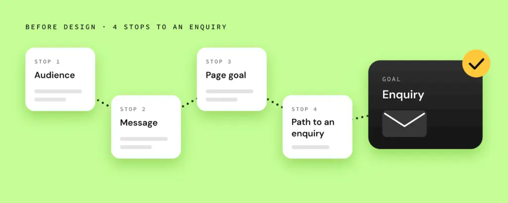
A website without enquiries usually has four gaps behind it: it’s unclear who the site is for. There’s no message that says in one sentence what you solve for whom. Individual pages have no goal. And there’s no clear path that leads visitors all the way to an enquiry.
Unclear who the site is for
Many websites try to appeal to everyone and end up reaching no one properly. If you haven’t decided who your site should convince, you can’t speak their language, answer their questions or address their objections. The managing director of a trade business looks for different signals than the marketing manager of a software company.
No clear message
The message is the one sentence that says what you do for whom and why it matters. Without it, empty phrases fill the gap: “holistic”, “tailored”, “with passion”. These words sound good but don’t set you apart from anyone. Visitors can’t make a decision based on them.
Pages without a goal
Every page should have a job. The services page should convince, the about page should build trust, the case studies page should provide proof. If pages only exist because they’re expected, their impact is left to chance. You can recognise these pages by the fact that there’s no next step at the end.
No path to an enquiry
Even a convinced visitor needs a clear next step. If the contact form is hidden in the footer or demands twelve required fields, you lose exactly the people who were almost ready. The path to an enquiry has to be visible, simple and in the right place.
Trust is part of that path too. Just before getting in touch, visitors ask themselves: who’s behind this, and will I reach a real person here? The Stanford Guidelines for Web Credibility name exactly this as a lever. Show that a real organisation stands behind the site and make contact easy: phone, address, email.
| Symptom on the website | Common cause | Question that was missing beforehand |
|---|---|---|
| Lots of visitors, hardly any response | Unclear audience | Who exactly should the site convince? |
| Copy full of empty phrases | No message | What do I solve for whom, in one sentence? |
| Visitors bounce from subpages | Pages without a goal | What should happen on this page? |
| Interest, but no enquiries | No path to an enquiry | What is the next step, and where is it? |
The table is a starting point, not a diagnosis. Bounces can also be caused by loading time or mobile display, for example. But it shows you where to look first.
What role does design still play?
Design helps visitors find their way, take in what matters faster and build trust. That requires the content to be right. A beautiful layout doesn’t turn an unclear statement into a convincing message. If clarity is missing, the lack of clarity just ends up looking more polished.
A team led by Gitte Lindgaard at Carleton University in Ottawa showed test subjects homepages for just 50 milliseconds. Even in that twentieth of a second, they rated the visual appeal very similarly to people who saw the same pages ten times as long.
Appearance also plays a part in credibility. In a large study by the Stanford Persuasive Technology Lab, 2,684 people evaluated real websites. Design was the most frequently mentioned factor: it came up in 46.1% of their comments. Two caveats apply: the study dates from 2002, and it measures credibility, not enquiries.
Design is the ship, clarity is the course. A fast, well-built ship gets you ahead quickly, but only if you know where you want to go. Without a course, you sail in circles with the most beautiful ship.
A well-designed button with clear contrast draws the eye and is more likely to get the click. But if it says “Learn more” and leads to a page with no next step, even the best contrast won’t help. If it says “Book a discovery call” and the visitor already knows what to expect, the design works to its full effect.
What does AI change about working on a website?
AI makes building a website much faster and cheaper: layouts, draft copy and entire pages can now be created in a short time. What AI doesn’t do for you is decide whom you want to convince and of what. That thinking has always been the deciding factor and it still is. Without it, you now just arrive at an interchangeable site faster.
An example: if the brief only says “modern website for a management consultancy”, the AI delivers exactly that. A neat layout, a mood image, lines like “We accompany you on your journey”. The result looks professional and could belong to any consultancy.
If the brief says the site addresses owners of family businesses facing succession, what worries them and which objection they usually raise first, the draft turns out differently. Headline, service copy and the next step are then aimed at a specific person. If you can’t tell the AI whom you want to reach and why those people should choose you, even the fastest draft won’t change much.
How do you find out whether your website lacks clarity?
The quickest way to find out whether your website lacks clarity is with a stranger. Show your homepage to someone who doesn’t know your offer, for ten seconds. Then ask what you offer, for whom, and what the next step would be. If you get three clear answers, you’re on a good course.
Before that, a step zero is worth it: send yourself a test enquiry through your contact form. If it doesn’t arrive or ends up in spam, your message never stood a chance. It sounds trivial, but it only takes two minutes.
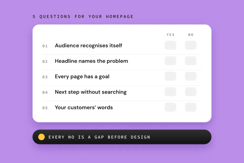
If the ten-second test goes badly, your site assumes prior knowledge. You narrow down where with five questions. The first four relate to the four causes. The fifth checks your language, because even an accurate message can be wrapped in jargon your customers never use themselves:
- Audience: Can you say in one sentence whom your website should convince, and does that person recognise themselves on the homepage?
- Message: Does the main headline say which problem you solve, or does it only describe who you are?
- Page goals: Can you name for every subpage what should happen there?
- Path to an enquiry: Can a convinced visitor find the next step from any page without searching?
- Language: Do you use your customers’ words or your internal jargon?
Also take a look at the enquiries you do get. If they come from the wrong customers or with the wrong expectations, your message is blurred. If none come at all, the path to an enquiry is usually missing, or your audience doesn’t feel addressed.
What should you clarify before redesigning?
Before you redesign your website, you should clarify what it should achieve, whom it should convince and with what message. Page structure and content follow from that. Only once this foundation is in place is it worth working on the design. It comes down to five points:
- Goal: What should the website do for your business?
- Ideal customers: Who are they, what triggers their purchase, what objections do they have?
- Message: What do you solve for whom, in one sentence?
- Page structure: Which pages do you need, and what is the goal of each one?
- Content: Which copy, proof and images carry your message?
If you design layouts for copy that doesn’t exist yet, you end up discussing colours instead of statements. That costs time and budget.
For us, this clarification comes at the start of every web design project, and one insight kept coming up: the offer was simply unclear and there was no clear next step for the visitor. Every secondary service had its own page, while the core service was hard for visitors to make out. They were left with a big question mark: what can you actually help me with, and what exactly do you want from me?
Frequently asked questions about websites without enquiries
Do I need a completely new website if my site brings in no enquiries?
Not necessarily. Often it’s enough to sharpen the message, page goals and path to an enquiry on your existing website. A new main headline, clearer service copy and well-placed next steps can make a big difference. A relaunch only pays off when the technical basis or the structure fundamentally no longer holds up.
Could it also be down to too few visitors?
Yes. Even the clearest website brings in no enquiries if hardly any of the right people find it. So check your analytics: how many visitors come each month, and through which search terms or channels? If there are few or the wrong ones, visibility is your first lever. If there are enough, the gap is on the site itself.
Can I create the clarity I need myself?
Yes, to a large extent. Your first conversations, email enquiries and customer questions contain almost everything you need: their problems, their words, their doubts. It usually gets difficult with your own perspective, because you know your offer too well. An outside view then helps you spot blind spots.
Conclusion
Your website rarely fails because of design, but because of the clarity that should come before it. Once audience, message, page goals and the path to an enquiry are clear, good design has something it can make visible. As your next step, take your homepage: first the test enquiry, then the ten-second test, then the five questions. Write down every no. That list is your brief for the revision, whether you tackle it yourself or with a service provider. If you’d like a second pair of eyes, use our free video website check: we look at your website and show you where the biggest levers for more enquiries are.
Sources
- Nielsen, J. (2011): How Long Do Users Stay on Web Pages? Nielsen Norman Group. Based on: Liu, C., White, R. W. & Dumais, S. (2010): Understanding Web Browsing Behaviors through Weibull Analysis of Dwell Time. SIGIR ’10.
- Newton, E. L. (1990): The Rocky Road from Actions to Intentions. Dissertation, Stanford University. Figures according to Heath, C. & Heath, D. (2006): The Curse of Knowledge. Harvard Business Review, December 2006.
- Lindgaard, G., Fernandes, G., Dudek, C. & Brown, J. (2006): Attention web designers: You have 50 milliseconds to make a good first impression! Behaviour & Information Technology, 25(2), 115–126.
- Fogg, B. J., Soohoo, C., Danielson, D., Marable, L., Stanford, J. & Tauber, E. R. (2002): How Do People Evaluate a Web Site’s Credibility? Results from a Large Study. Stanford Persuasive Technology Lab / Consumer WebWatch.
- Fogg, B. J. (2002): Stanford Guidelines for Web Credibility. Stanford Persuasive Technology Lab.