Visitors to your website rarely decide based on the objective quality of your offer. They decide according to recurring psychological principles – subconsciously, in fractions of a second, long before reason catches up. Knowing these patterns helps you understand why one and the same page converts for one visitor and not for the next.
This isn’t a catalogue of tricks. It’s the reason why structure, wording and proof on your page work at all – or don’t.
Key takeaways
- Evaluation principles (loss aversion, framing, anchoring): visitors never judge prices and offers in absolute terms, always relative to a reference point – and a loss weighs more heavily than a gain of the same size.
- Trust principles (social proof, authority, reciprocity): when objective certainty is missing, visitors replace it with the behaviour of others, with status signals or with the feeling of wanting to give something back.
- Action principles (scarcity, commitment, choice reduction, cognitive fluency): these four lower the threshold for acting itself – through urgency, small upfront commitments, fewer options or a page that’s effortless to process.
- System 1 decides first: most purchase decisions run through fast, intuitive thinking – reason usually only supplies the arguments afterwards to justify the decision already felt.
- Used honestly, these principles are a trust advantage; used dishonestly, they’re a legal risk – dark patterns such as fake scarcity can lead to legal warnings.
Why do visitors rarely decide rationally?
Most decisions run through what psychologist Daniel Kahneman calls System 1: fast, intuitive, emotion-driven thinking. System 2 – slow, analytical, effortful – usually only kicks in afterwards to justify the decision already felt. That’s why the following ten principles work more reliably than pure argument: they speak to System 1 directly, not to the justification that comes afterwards.
Most of the studies cited here come from US B2C e-commerce – one decision-maker, one impulse, a few seconds to think. In German-speaking SMEs with longer decision cycles and several people involved, urgency and scarcity have a noticeably weaker effect, because rarely does anyone decide alone and spontaneously. Authority and social proof, on the other hand, gain weight, because they make the internal justification to colleagues or management easier. That doesn’t mean the principles don’t work in B2B – just that their weighting shifts.
Cialdini names seven principles of persuasion. This article deliberately leaves out two of them – liking and unity, added in 2016 – because they can hardly be used in isolation on a website: they need personality or shared identity, which can’t be created in a block of text. Instead, four cognitive biases that work directly in a web context are added: framing, anchoring, choice overload and cognitive fluency. That makes ten principles that can actually be put to work on a page.
Why does a looming loss weigh more heavily than a benefit?
Loss aversion means that a possible loss weighs on average about twice as heavily as a gain of the same size. The pattern comes from Kahneman and Tversky’s prospect theory and is one of the best-documented effects in behavioural economics.
For your website, this means: wording that focuses on missing out works more reliably than wording that only emphasizes the benefit. Imagine two buttons: “Save 10%” versus “Don’t miss out on 10% off”. The content is identical – only the frame flips from gain to looming loss, and exactly this frame triggers the stronger feeling. A “30-day money-back guarantee” works with the same mechanism: it explicitly sets the visitor’s risk of loss to zero instead of leaving it with them unspoken – and thus removes exactly the worry that would otherwise weigh most heavily.
The limit: loss aversion only works if the loss is real. A discount that still applies after the “deadline” has passed destroys exactly the trust you wanted to build.
Why does wording decide more than content?
The framing effect means that identical facts have different effects depending on whether they’re phrased as a gain or a loss. “Save 50 euros” and “Don’t lose 50 euros” mean the same amount – but have different strengths.
Framing is closely related to loss aversion but distinct: it’s not about the loss itself but about the wording that creates it. Studies suggest that loss-framed wording converts more reliably closer to the conversion point – for example right before the form – than gain-framed wording. Further up the funnel, when a visitor is still getting their bearings rather than deciding, positive, gain-oriented wording comes across as more credible and less pushy. A practical example: on the homepage, “More enquiries thanks to a clear website” works as a gain frame. Right before the contact form, “Stop missing enquiries because of an unclear page” has a stronger effect – the visitor is about to decide, no longer at the start of getting their bearings.
The limit: framing changes how an offer comes across, not its substance. A weak offer stays weak however you phrase it – at most you speed up the disappointment afterwards.
Why does a price only work in comparison to another?
Anchoring means that the first value a visitor sees subconsciously becomes the yardstick for everything that follows – regardless of whether that value makes objective sense. The decoy effect uses the same mechanism deliberately: a deliberately unattractive third option makes another option look particularly attractive by comparison.
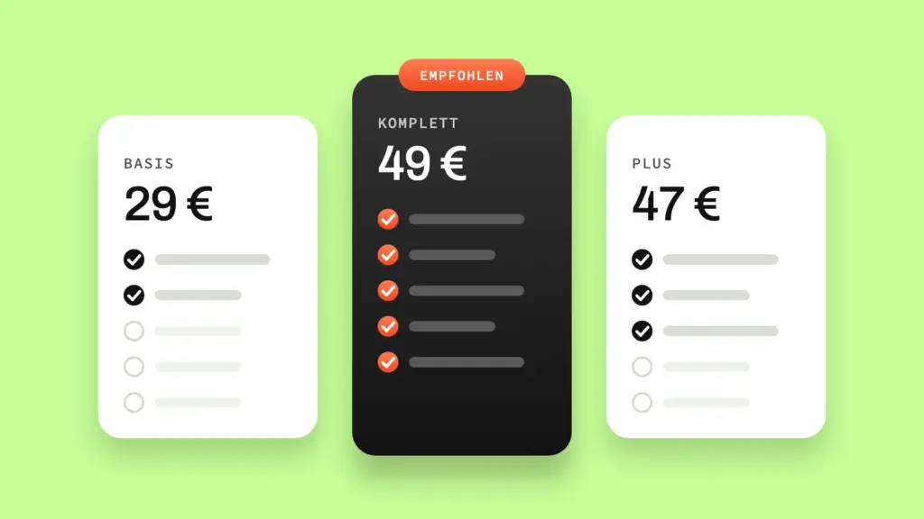
The best-known evidence comes from Dan Ariely’s “Predictably Irrational”: in The Economist’s subscription model, test subjects chose between an online-only subscription for 59 dollars and a print-and-online combination for 125 dollars. With only these two options, 68 percent chose the cheaper online subscription, only 32 percent the more expensive combination. When Ariely added a third option – a print-only subscription at the same 125 dollars, which was obviously inferior – the ratio flipped: 84 percent now chose the combination. The print-only option served just one purpose: making the combined offer look unbeatable by comparison.
For service packages, this means: three tiers with a deliberately positioned middle option steer the choice more reliably than a pure feature list could.
The limit: the anchor has to remain credible. A comparison price that’s obviously artificially inflated turns the effect into its opposite.
Why do people act faster when something is limited?
Scarcity means that a perceived limit – in quantity or time – increases the perceived value of an offer and prompts faster action. Cialdini’s research on this principle is among the well-documented effects in the psychology of persuasion.
For a service website, this means: a real capacity limit – such as “currently two free project slots this quarter” – has a stronger effect than any discount, because it names a real consequence, not an invented one. Being specific matters: “limited places” without a number comes across as vague and therefore less credible than a precise statement such as “two of four slots still free”. Specificity is itself a trust signal here, not just an urgency trigger. The difference from a fake countdown is crucial – more on that in the section on ethics and law below.
The limit: scarcity only works as long as it’s true. If it’s recognizably invented, the effect doesn’t just fizzle out – it damages trust in everything else on the page too.
Why do we trust the behaviour of others more than an advertising promise?
Social proof means that, under uncertainty, people use the behaviour of others as a decision shortcut – what many people do or approve of is subconsciously seen as the safe route. The mechanism behind it is conformity: it reduces the perceived risk of a decision without the visitor having to check the offer themselves.
How strongly this effect works on a website and where exactly it’s best placed – in the hero against baseline scepticism, further down the page against specific objections – is covered in detail in the article on landing page structure. Here only the mechanism counts: vague statements like “many satisfied customers” don’t trigger the effect because they offer nothing concrete to imitate. Which form of proof works best depends on the offer: for a service, a credible case description often convinces more than a pure star rating, because it shows that the visitor’s own situation has already been solved once.
The limit: social proof only works with verifiable statements. Without evidence, trust turns into distrust.
Why does an expert opinion convince more than a sales argument?
Authority means that status signals – expertise, experience, visible competence – lower the perceived risk of a decision before the visitor has even read a single argument. People tend to trust what someone with visible expertise says more than a general claim.
For an SME, this doesn’t mean hiring prominent testimonial givers – in German-speaking SMEs that tends to seem implausible rather than convincing. More effective is concrete, verifiable expertise: the number of projects completed in exactly this industry, a clear specialization, your own expert articles that show someone here really understands what they’re talking about. The order counts too: a competence signal right next to the offer has a stronger effect than the same signal in a separate “About us” section that many visitors never click on.
The limit: unsubstantiated claims of authority – “expert in …” without evidence – have the opposite effect. They trigger exactly the scepticism authority is meant to dispel.
Why do people feel obliged when they receive something first?
Reciprocity means that something given upfront creates a subconscious need in the recipient to give something back. If a visitor first receives something genuinely useful, their threshold for giving something in return – such as sending an enquiry – drops.
Freemium models and free trials use exactly this mechanism: someone who has genuinely used software for two weeks feels differently about cancelling than about not using it. For a service website, the same principle works on a smaller scale: a checklist, a short audit, an honest assessment before an enquiry is even made. Timing matters: something given upfront works best when it comes right before the actual decision – a short audit right before the contact form closes the gap between benefit and action more tightly than a freebie scattered loosely somewhere on the page.
The limit: reciprocity only works if what’s given upfront has real value. A freebie that’s just disguised advertising doesn’t trigger the mechanism – visitors reliably recognize the difference.
Why does a small yes almost automatically lead to a big yes?
Commitment and consistency mean that people tend to act in line with earlier – even small – decisions to keep their self-image consistent. Once someone has decided to take the first step, they’re less likely to abandon the action before the last one.
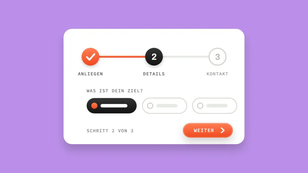
Multi-step forms use this effect deliberately: a contact form in three short steps performs better in many tests than a single long form, because every completed step creates a small self-commitment. A visible progress indicator reinforces this further – Nunes and Drèze showed with the endowed progress effect on loyalty cards that visibly started progress increases completion rates, even when the actual path stays just as long. A mechanism that transfers directly to progress indicators in forms.
The limit: too many steps reverse the effect – more on this in the next section on choice overload.
Why do fewer options often convert better than many?
Choice overload means that too many options increase the cognitive load and tend to prevent decisions rather than make them easier – the visitor postpones the decision instead of making it. The effect became famous through Iyengar and Lepper’s jam experiment (2000): a stand with 24 varieties attracted more curiosity but led to significantly fewer purchases than the same stand with only 6 varieties.
Later meta-analyses qualify this, showing the effect doesn’t appear equally strongly in every context – a reminder not to treat it uncritically as a law of nature but as a tendency. For a website, in concrete terms: three packages with clearly distinguishable service levels can be compared faster than seven variants with subtle differences that the visitor would have to work out themselves.
The limit: too little choice feels restrictive. The balance lies between genuine freedom of choice and being overwhelmed, not at zero.
Why do we trust websites that feel easy?
Cognitive fluency means that information that’s effortless to process is subconsciously rated as more credible and trustworthy than information that requires effort. The brain confuses ease of processing with truth.
Studies show that the first impression of a website forms in fractions of a second, long before a visitor consciously thinks about the content. A clear hierarchy, familiar navigation patterns instead of creative detours and short, understandable sentences measurably reduce the cognitive load – which matches the basic rule of any well-written website copy: short sentences, clear structure. Loading time belongs to this principle too: every second of waiting adds cognitive friction on top of the visual – a fast page automatically feels more trustworthy than a slow one, regardless of the content.
The limit: cognitive fluency doesn’t replace substance. An easy-to-read page with no real offer behind it seems trustworthy – until the visitor notices there’s nothing behind it.
Where does psychology end and manipulation begin?
The boundary is truth: each of the ten principles only works honestly as long as the underlying statement is true. A real capacity limit is scarcity. An invented countdown is a dark pattern – and that’s no longer just a trust risk but increasingly a legal one as well.
The Dovetail study from 2023 shows that 56 percent of 1,000 online users surveyed lose trust in a brand as soon as they recognize manipulative design. A joint review by the FTC, ICPEN and GPEN in 2024 found at least one possible dark pattern on almost 76 percent of 642 subscription platforms examined. A study published in the Journal of Legal Analysis even shows that mild dark patterns alone can double the conversion rate in the short term. What these figures don’t show: the loss of trust that follows.
Legally, the framework is getting tighter. The EU Digital Services Act explicitly prohibits manipulative interfaces, and misleading availability claims – fake scarcity, fake countdowns – can lead to legal warnings under German competition law. Courts have already dealt with comparable cases in recent years. A good overview of typical patterns is provided by deceptive.design by Harry Brignull, who originally coined the term dark pattern.
For dock7, the same logic applies here as with data protection: GDPR compliance isn’t an obstacle but a competitive advantage – and the same goes for honestly applied psychology. Whether a principle actually works for your audience can only be shown by testing in practice anyway, not by theory.
Overview: where each principle applies
| Principle | Typical use | |
|---|---|---|
| Loss aversion | Wording of discounts and offers | – |
| Framing effect | CTA copy, price presentation | – |
| Anchoring & decoy effect | Pricing and package page | – |
| Scarcity & urgency | Offer time windows, capacity | Ethics section above |
| Social proof | Hero, further down the page | Landing page structure |
| Authority | Case studies / about section | – |
| Reciprocity | Before first contact (freebie, audit) | – |
| Commitment & consistency | Multi-step forms | – |
| Choice overload | Package and price selection | – |
| Cognitive fluency | Overall page structure | – |
Frequently asked questions about the psychological principles of conversion
Do I have to use all 10 principles at once?
No. Two or three principles used deliberately and honestly usually make a bigger difference than trying to fit all ten in at once. More important than completeness is that every principle you use fits the real situation of your offer.
Do these principles also work in a B2B and SME context, not just in e-commerce?
Yes, but with a shifted weighting. Urgency and scarcity have a weaker effect in B2B with long decision paths, because decisions are rarely made spontaneously. Social proof and authority, on the other hand, become more important, because they make the internal justification to colleagues or management easier. The mechanics stay the same; only their strength shifts depending on the decision process.
How do I tell legitimate scarcity from a dark pattern?
The question is: is the statement still true if nobody checks it? A real capacity limit remains whether or not a visitor questions it. A countdown that simply restarts once it runs out, or “limited” availability that never actually decreases, is a dark pattern – and, as described above, increasingly a legal risk too.
Conclusion
These ten principles aren’t a catalogue of tricks to work through one by one. They explain why structure works at all – why a clear landing page structure builds trust, why a short form brings more conversions than a long one, why a genuine trust signal carries more weight than a loud advertising promise. Use them honestly – not as a trick, but as an understanding of how people really decide. Everything else about implementation at page level is in the CRO guide for SMEs.