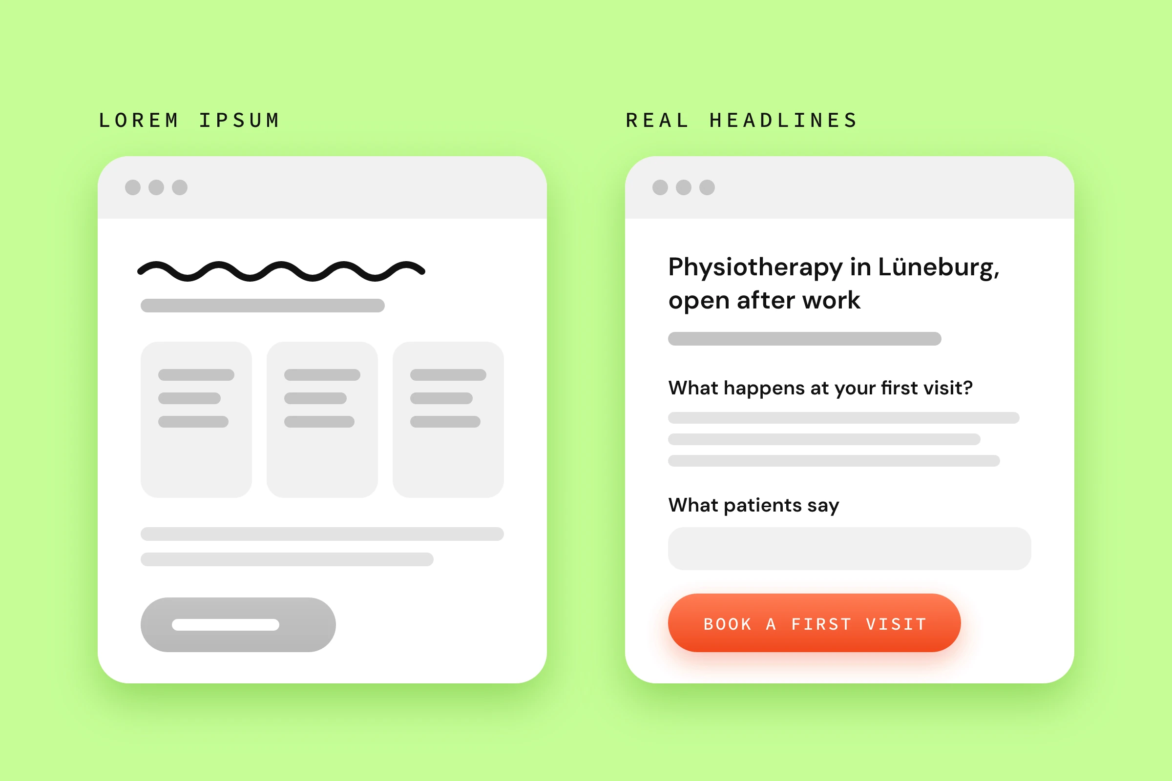
A wireframe with real headlines is a simplified sketch of a web page that already contains the actual headings, key sentences and button texts instead of placeholder text, so you can test your message before colours and images are added. That sounds like a minor detail in the process. Yet it decides what your project ends up discussing. With “lorem ipsum” in the draft, a page looks finished even though the most important question is still open: what are you actually telling your visitors?
Key points at a glance
- Placeholder text pushes the work on your message to the end of the project. By then, every change hits a layout that is already in place.
- A wireframe needs a written-out main heading, subheading, section headings and button texts. Body copy can stay as bullet points, images as a described box.
- The order of the sections follows your visitors’ questions, from “Am I in the right place?” to “What do I do now?”.
- Read only the headings from top to bottom. If together they give an answer that makes sense, the wireframe works.
- Headings you settle in the wireframe also help Google and AI search to understand your page.
Why does placeholder text in a wireframe get expensive?
Placeholder text gets expensive because it anticipates decisions nobody has made yet. The layout fixes how long a heading may be, how many sections there are and in which order they appear. When the real copy arrives later, it rarely fits these constraints. Then either the text gets cut or the layout gets rebuilt.
Picture a homepage with “Lorem ipsum dolor sit amet” at the top. Below it, three boxes of equal size, each with three lines of placeholder text. It looks tidy, and yet it already contains a whole set of assumptions. Your main message fits on one line. Your offer splits into three equally important parts, and each of them needs roughly the same amount of explanation. At this point, nobody has checked any of that.
In our article on the website concept, we described how placeholder text shifts the feedback away from the message and towards spacing and boxes. For the schedule, there is a second consequence. The copy becomes the last open task, and the whole project ends up waiting for it. Design signed off, development done, launch date in the calendar, and the homepage still speaks Latin.
In practice, we often see clients bring in another provider for the copy. Getting professional support here is a good idea. What matters is that this provider commits to enough capacity at the start of the project. We have had projects where the copywriter could only work on the project at weekends, on the side, and the texts, including client feedback, arrived slowly. As a result, the launch date had to be pushed back by three weeks.
Copy that is only written once the layout is finished also gets written to length. The question while writing becomes “What fits into three lines?”. The more important question would be: “What does my client need to read at this point to keep going?” You can tell from the result, even if it looks good.
How much real copy belongs in a wireframe?
A wireframe should contain every sentence visitors read when they skim: the main heading, the subheading, every section heading and every button text. Body copy can stay as bullet points, images as a grey box with a description of what it should show. In the wireframe, you only need to write out what carries the page.
The table shows where the line is, using a hypothetical physiotherapy practice as an example. The sentences are made up to illustrate the principle and do not come from a project.
| Element | In the wireframe | Example |
|---|---|---|
| Main heading (H1) | written out | “Physiotherapy in Lüneburg, open after work” |
| Subheading | written out | “Evening appointments, with or without a referral” |
| Section headings | written out | “What happens at your first visit?” |
| Button texts | written out | “Book a first visit” |
| Body copy | bullet points | First visit: consultation, assessment, treatment plan |
| Proof | named | two patient testimonials on back pain |
| Images | described box | Photo: treatment room with therapist, no stock photo |
The proof row often gets skipped. “References go here” is not content. If you name in the wireframe which testimonial or project goes in this spot, you find out early whether you actually have that proof. If it is missing, that becomes a task for the coming weeks rather than a surprise shortly before launch.
The wireframe defines what is on the page and in which order. The full copy, who delivers it and by when, is handled by the content plan. The two work together: every bullet point in the wireframe becomes a line there with a name and a deadline.
How do you create a wireframe with real headlines?
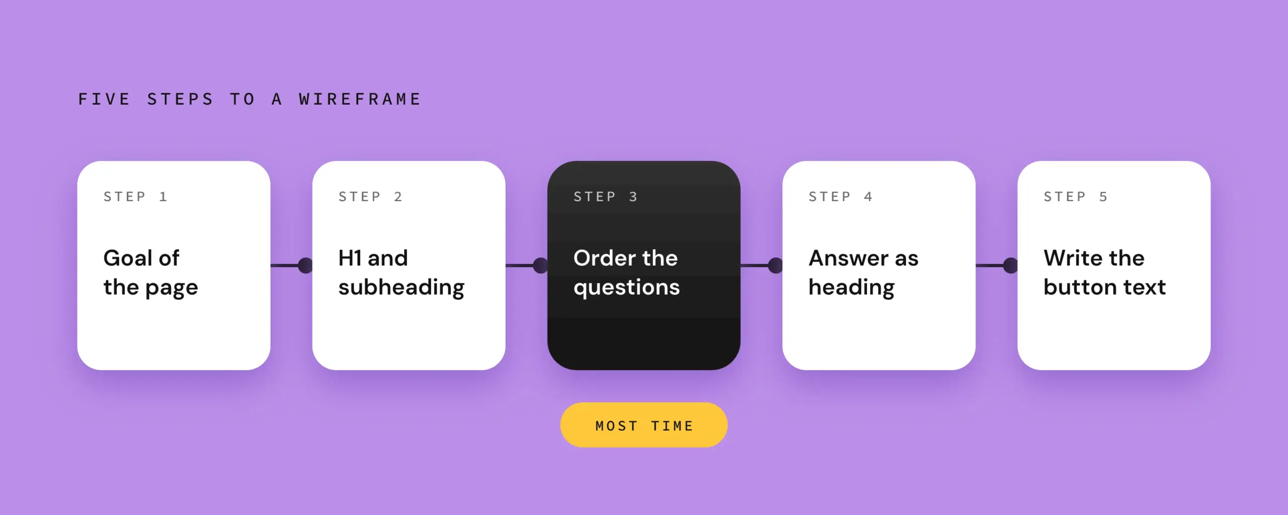
You create it in five steps: note the goal of the page, set the main message as the heading, put your visitors’ questions in order, give every section an answer as its heading, and write out the next step as the button text. Paper or a simple slide tool is enough. You do not need a design tool at this stage.
Before you start, gather what you have already worked out:
- your page structure with a goal and next step for each page,
- your message from your positioning in one sentence,
- the buying triggers and objections from your work on your ideal customers.
- Note the goal and the next step. At the very top of the sheet goes what a visitor should do after this page. If your page structure does not say yet, start there.
- Write the main message as the H1. Your message becomes the heading at the very top. The subheading adds what the sentence leaves open, for example who it is for, where, or in what form. Write two or three versions and decide only during the test.
- Put your visitors’ questions in order. Write on sticky notes what someone needs to know before getting in touch: Am I in the right place? What exactly do I get? Can I trust this? What does the next step cost me? Your objections belong here too. Arrange the notes in the order the questions come up in your visitors’ minds.
- Give every section an answer as its heading. The question about trust does not become the heading “References” but a statement such as “What patients tell us after treatment”. Below it goes one sentence that sums up the answer, plus a keyword for the proof.
- Write out the button text. “Submit” and “Learn more” do not say what happens after the click. “Book a first visit” or “Arrange a call back” do. The button text is often the last sentence someone reads before deciding.
Step 3 deserves most of your time. You can rewrite a heading in a minute. A section in the wrong place answers a question your visitor has not even asked yet, and the question on their mind only comes three sections later.
In our experience, clients find step 3 the hardest. The reason is the wrong perspective. Clients try to answer the questions from their own point of view instead of putting themselves in their target group’s shoes.
How do you know your wireframe works?
Your wireframe works if the headings alone make clear what you offer, who it is for and what the next step is. You can check this with a headline test: write all the headings and button texts of the page one below the other, without body copy, and read them out to someone who does not know your offer.
Seeing a wireframe of the new homepage for the first time is not always easy for clients. That is why we tell them in advance what they will see: grey boxes and real sentences, no design yet. Without that heads-up, a client may already expect a design draft, and this phase can quickly end in disappointment.
For the test, find someone as close to your clients as possible. Partners and colleagues know your offer too well and fill in the gaps as they listen. And afterwards, do not ask whether they like it. These three questions are more useful:
- What does this page offer?
- Who is it meant for?
- What would you do next?
If the answers differ from what you wanted to say, the problem lies in the message. At this point, there is no layout yet that you would have to rebuild.
Before the test, go through this list once yourself:
- The H1 and subheading say what you offer and who it is for.
- Every section heading answers a question instead of just naming a topic such as “Services” or “About us”.
- The most important objection comes up before you ask for contact.
- Every button text says what happens after the click.
- No statement appears twice on the page.
Why do real headlines also help with Google and AI search?
Search engines and AI search tools use headings to structure a page and to match individual sections to a question. If the headings are created in the wireframe, you plan this structure deliberately. If they only come at the end, they are often squeezed into existing boxes and name topics where answers could be.
A heading like “Our services” tells a machine as little as it tells a person. “Which treatments does health insurance cover?” is a question people actually type into a search, and the section below can answer it directly. Google can tell from it what the section is about. Answer engines such as ChatGPT or Perplexity like to draw on sections that make sense on their own and answer a clear question.
In the wireframe, you settle two things for this. You phrase section headings as a question or a clear statement wherever your visitors want to know something specific. And you decide the hierarchy at the same time: one H1 per page, with H2s for the sections below. That takes a few minutes in the wireframe. In a finished layout, the same correction often means rearranging boxes.
Good headings do not replace keyword research. But they give it a fixed place on the page, instead of keywords being sprinkled into finished copy afterwards.
Frequently asked questions about wireframes with real headlines
What is the difference between a wireframe, a mockup and a prototype?
A wireframe shows the structure and content of a page without visual design, usually in greyscale. A mockup is a static design with colours, fonts and images, showing how the page will look later. A prototype is clickable and shows how visitors move through the pages. Real headlines belong in the very first stage, because the other two build on it.
Do I need a tool to create a wireframe?
For a first wireframe, a sheet of paper in portrait format is enough: draw boxes from top to bottom and label them. Digital tools such as Figma help when several people work on the draft or when you hand it over as a template for the design. Whether the page works depends on the sentences in the boxes, not on the tool you draw them with.
Who writes the headlines if I am not a copywriter?
You are best placed to write the first version yourself, because nobody knows your clients’ questions as well as you do. Take your notes from client conversations and use the phrases your clients use themselves. A copywriter or agency can then sharpen, shorten and align the wording, provided they commit to having enough time for it. Improving an existing headline is much easier for them than inventing one from scratch.
Does every subpage need its own wireframe?
A wireframe pays off above all for pages that lead visitors to a decision: the homepage, the most important service pages and, where relevant, a landing page. Legal notice, privacy policy or blog posts follow a fixed template. Start with the homepage. Its sections often show you how the service pages should be structured.
Conclusion
A wireframe with real headlines brings the hardest question of your web project forward: what you tell your visitors and in which order. As long as the page consists of grey boxes, every change costs a few minutes rather than a rebuild. Take your homepage today, write all the headings and button texts one below the other on a sheet of paper, and read them out to someone who does not know your offer. If you would like a second opinion on your current website afterwards, we will look at it in our free website check and tell you by video where it is losing enquiries.